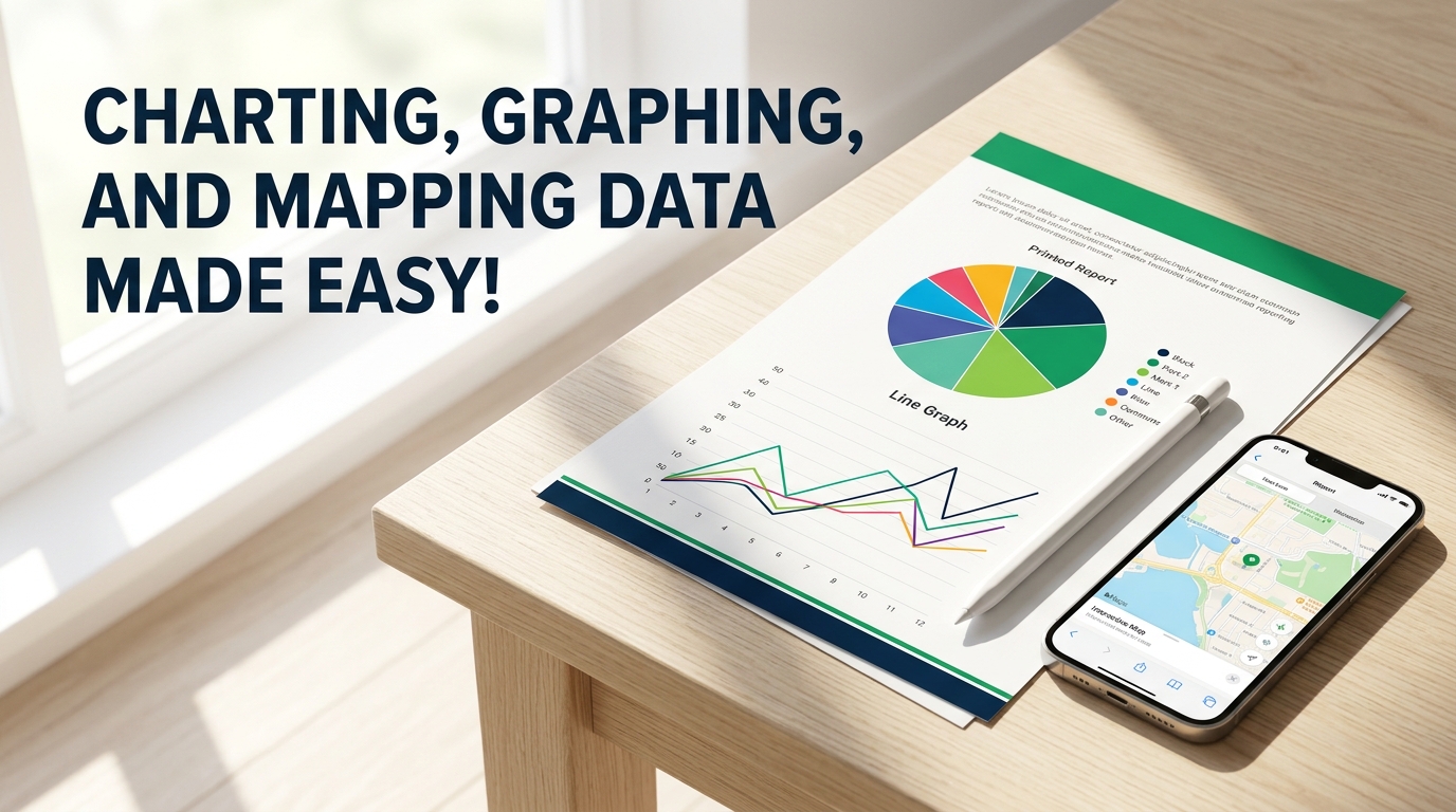
In a data-driven world, financial professionals are expected to not only analyze numbers but also translate them into compelling stories that drive decisions. This course is tailored for those who want to elevate their data presentation skills using Excel and other popular tools. Participants will dive into the art of charting, learning how to choose the right graph for their data and audience. Whether it’s a pie chart that reveals a budget’s composition or a line chart that shows financial trends over time, attendees will leave with a thorough understanding of each chart’s purpose and application. Beyond the basics, this course offers a deep dive into the Microsoft Office suite’s charting capabilities, ensuring that participants can seamlessly integrate their visuals into Word, PowerPoint, and beyond. With hands-on exercises, they’ll transform raw figures into clear, informative charts that make an impact. By the end of the sessions, financial professionals will be adept at mapping data in a way that tells a story, engages stakeholders, and influences strategy. Don’t miss the opportunity to enhance your presentations and reports—secure your spot today and start turning your data into persuasive narratives that resonate with your audience.
Financial professionals eager to elevate their Excel reporting should attend.
No. This is a basic level course and there are no formal prerequisites. Having a working knowledge of Excel is helpful, but we'll build your skills from the ground up.
While we focus heavily on Excel, we also compare its functions with other charting tools. You'll also learn how to integrate your work into the broader Microsoft Office suite like Word and PowerPoint.
We focus on data design and storytelling. The goal is to help you take raw figures you already have and turn them into impactful visual narratives.
We cover a wide range of visuals, from basic pie and line charts to more advanced techniques. You'll learn which specific types represent different financial trends most effectively.
Quite a bit. The course includes hands-on exercises designed to let you practice transforming datasets into informative charts in real time.
I created this course because I spent years watching brilliant financial professionals lose their audience's attention by burying insights in dense, unreadable spreadsheets. I want to show you how to turn those raw figures into visuals that actually make sense to your stakeholders. This is for anyone who feels like their data has a story to tell but hasn't found the right way to show it yet.
Reach out for more information or to bring this training to your organization.
Interested in bringing this training to your team, or want more information? Send a note and we’ll get back to you.